
Website Creation
I proposed, prototyped, and created a Campanile Partners company site that could be both easily operated by the founder + effectively conveyed information about Campanile Partners to potential clients.
Logo and Brand Identity Creation
Through meetings with the founder, independent design and rounds of iteration, I founded the Campanile Partners logo and brand identity.
Impact
By the end of my internship term, I had crafted an approachable yet professional online presence for Campanile Partners. The website and brand identity existed as a sustainable resource for potential clients, while expanding company presence beyond its existing network.
Campanile Partners is a small-scale consulting business operating within the sphere of technology and telecommunications.
When I joined Campanile Partners, it marketed itself through word-of-mouth; therefore, it lacked a clear brand identity and internet presence. The website was a one-page site with minimal information on previous clients and services; this summer, the goal was to:
What site features would be the most useful and informative for visitors?
Before jumping into work on the logo and site, I conducted market research with five similarly sized consultancies.

Research concluded that,
An effective consultancy site is one that efficiently communicates to a potential client what Campanile Partners stands for, who it would be a good fit for, why it is a good fit, and how to get involved.
We aimed to avoid confusing website design (randomly placed images or slogans), and repetitive information.
I aligned findings with the founder's goals for the site, and we landed on a simple and streamlined site with the flexibility for expansions in the future.
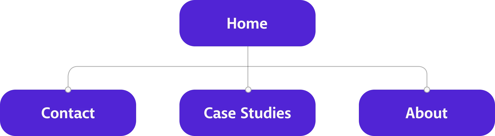
Next, I generated a preliminary site map for the founder's review.
We landed on a final site map that would become the framework for my site design going forward.
After my internship term, the founder planned to manage the website himself. Therefore, he preferred a site that was simple and streamlined-- not only in its design, but also in its platform. Therefore, when putting together prototypes for the site, I had to keep Google Sites' capabilities in mind.

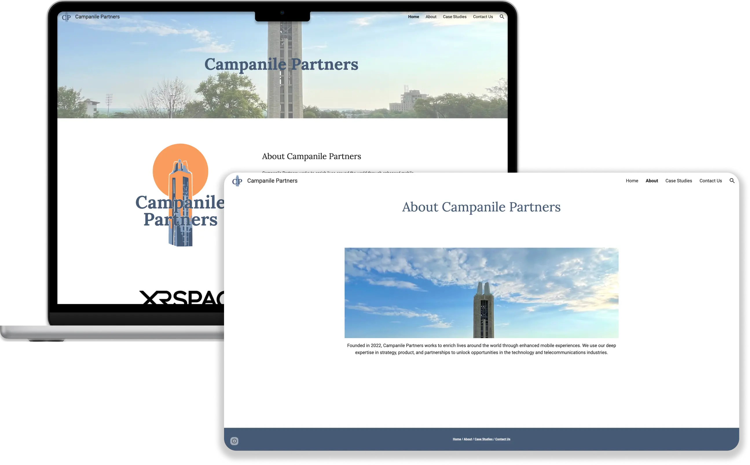
HOME PAGE
Initially, I proposed the idea of a single-page site where clients could do a top-down scroll through the site to get a general idea of Campanile Partners' capabilities.
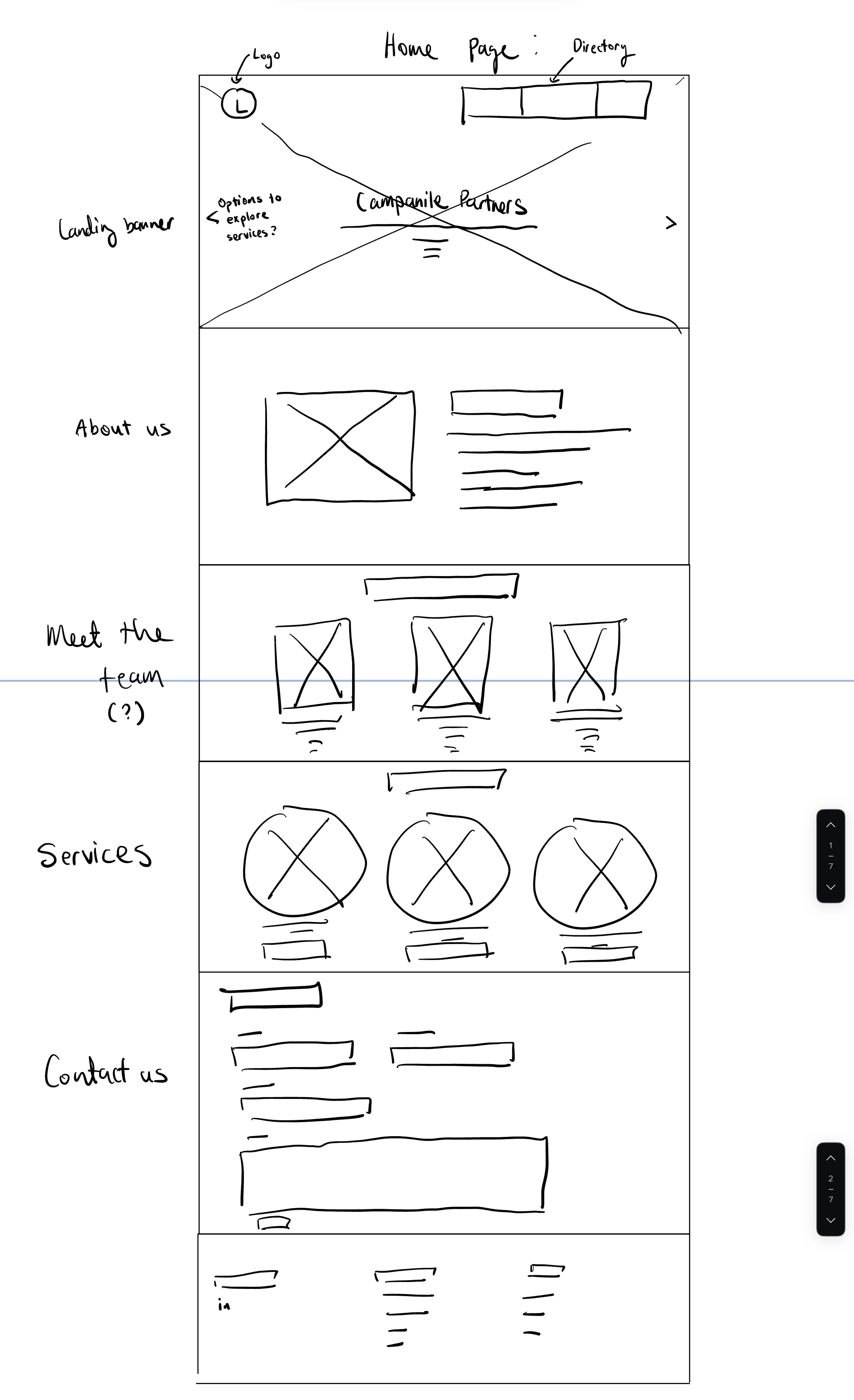
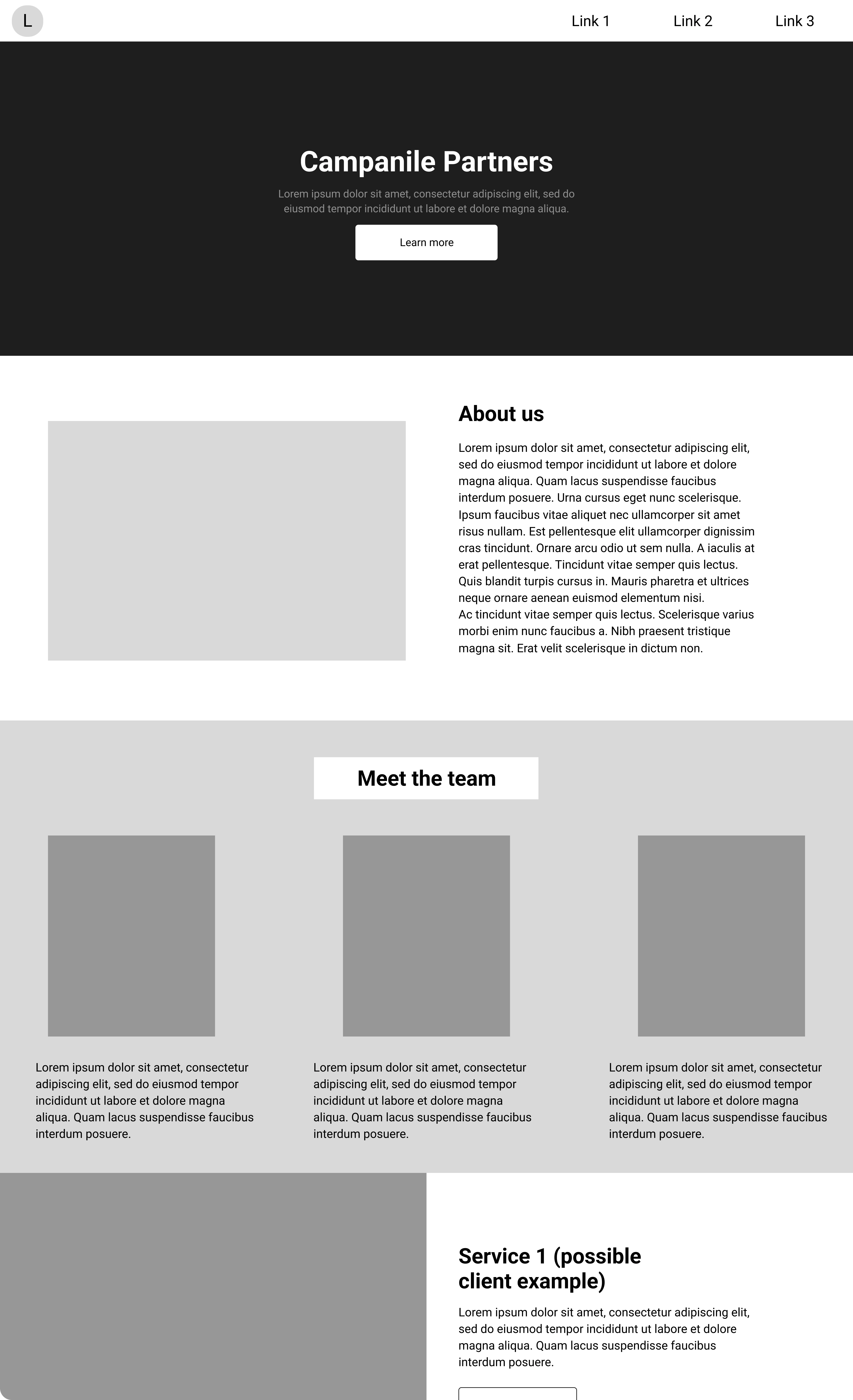
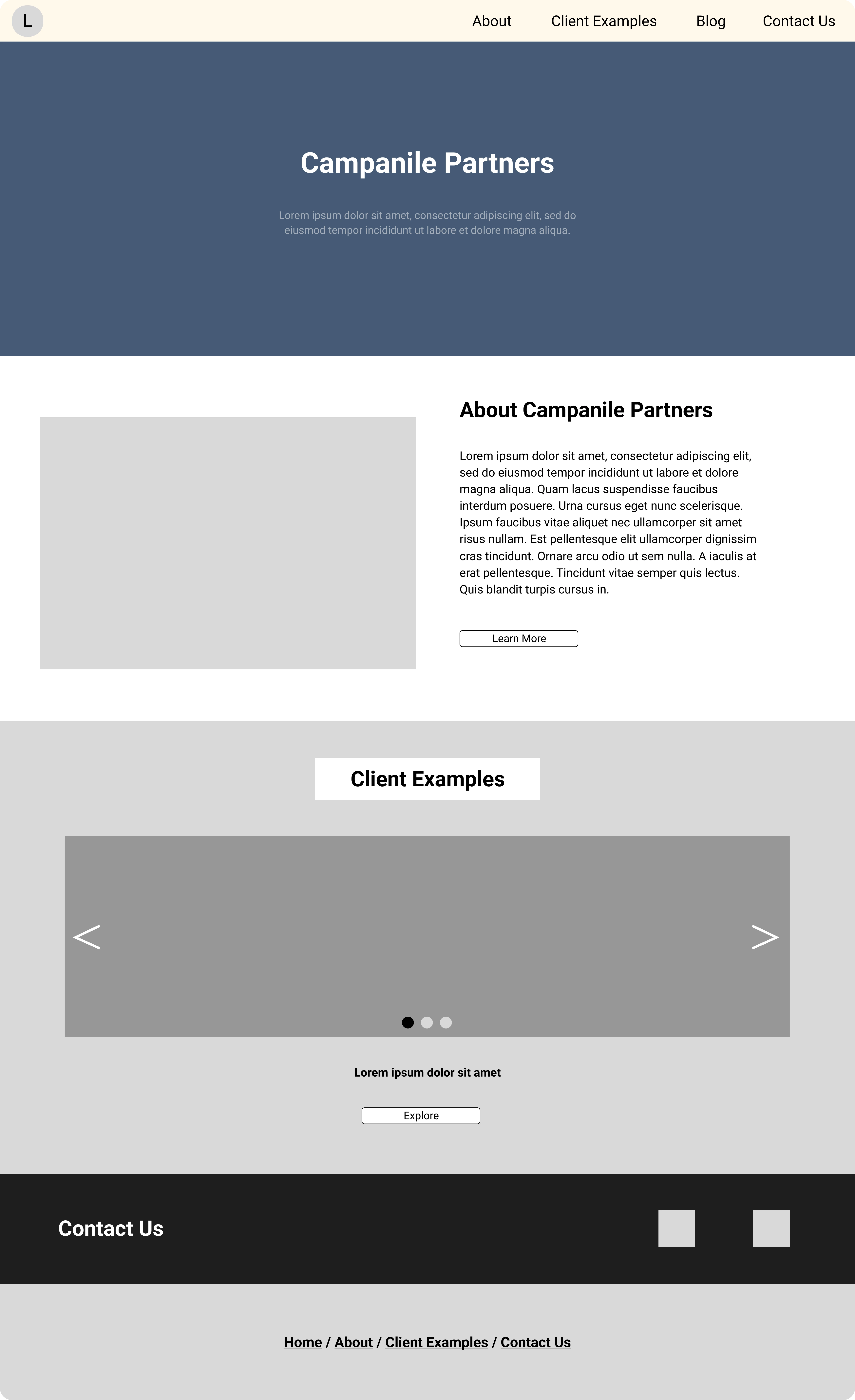
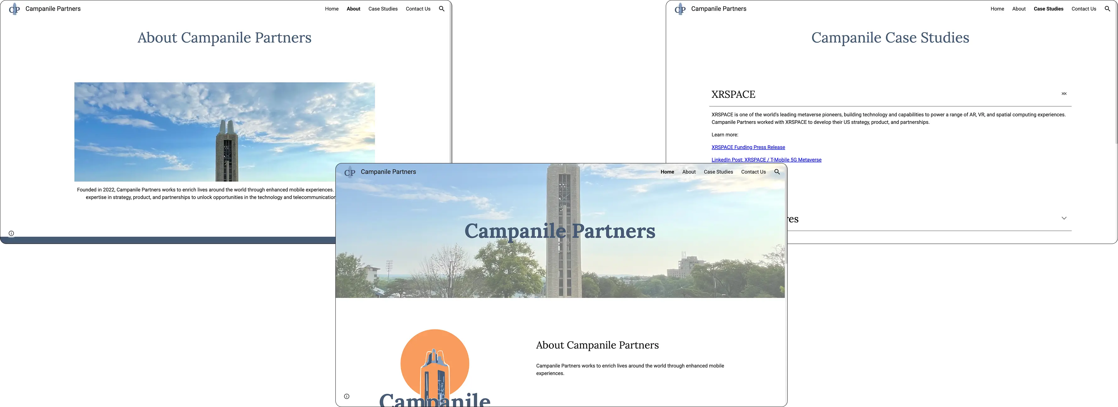
ABOUT PAGE
The founder and I wrote copy for the "About" section; we also implemented the "Client Examples" section following our benchmarking research, where runthroughs with similar sites that contained this aspect made for a smoother user experience.
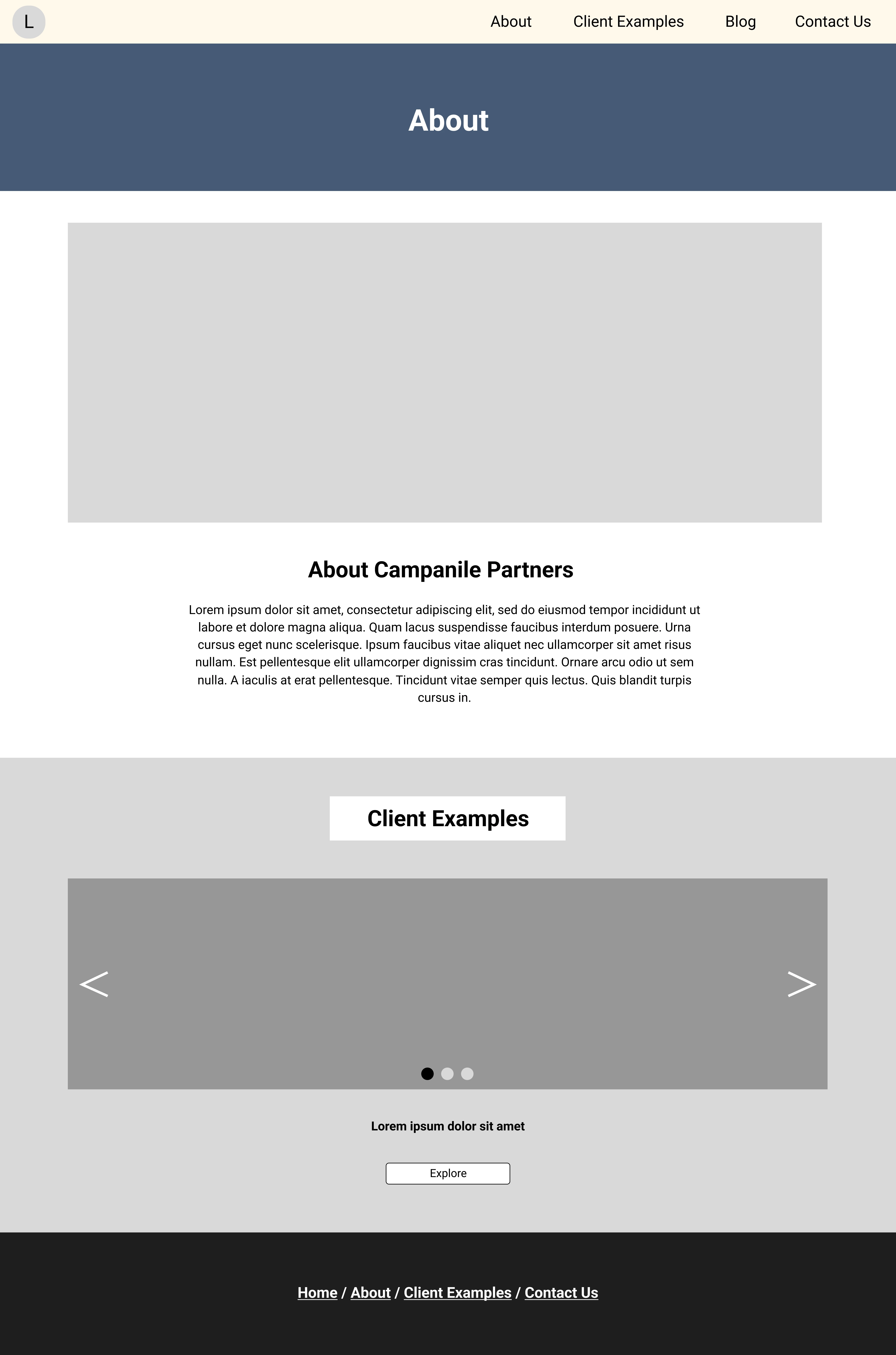
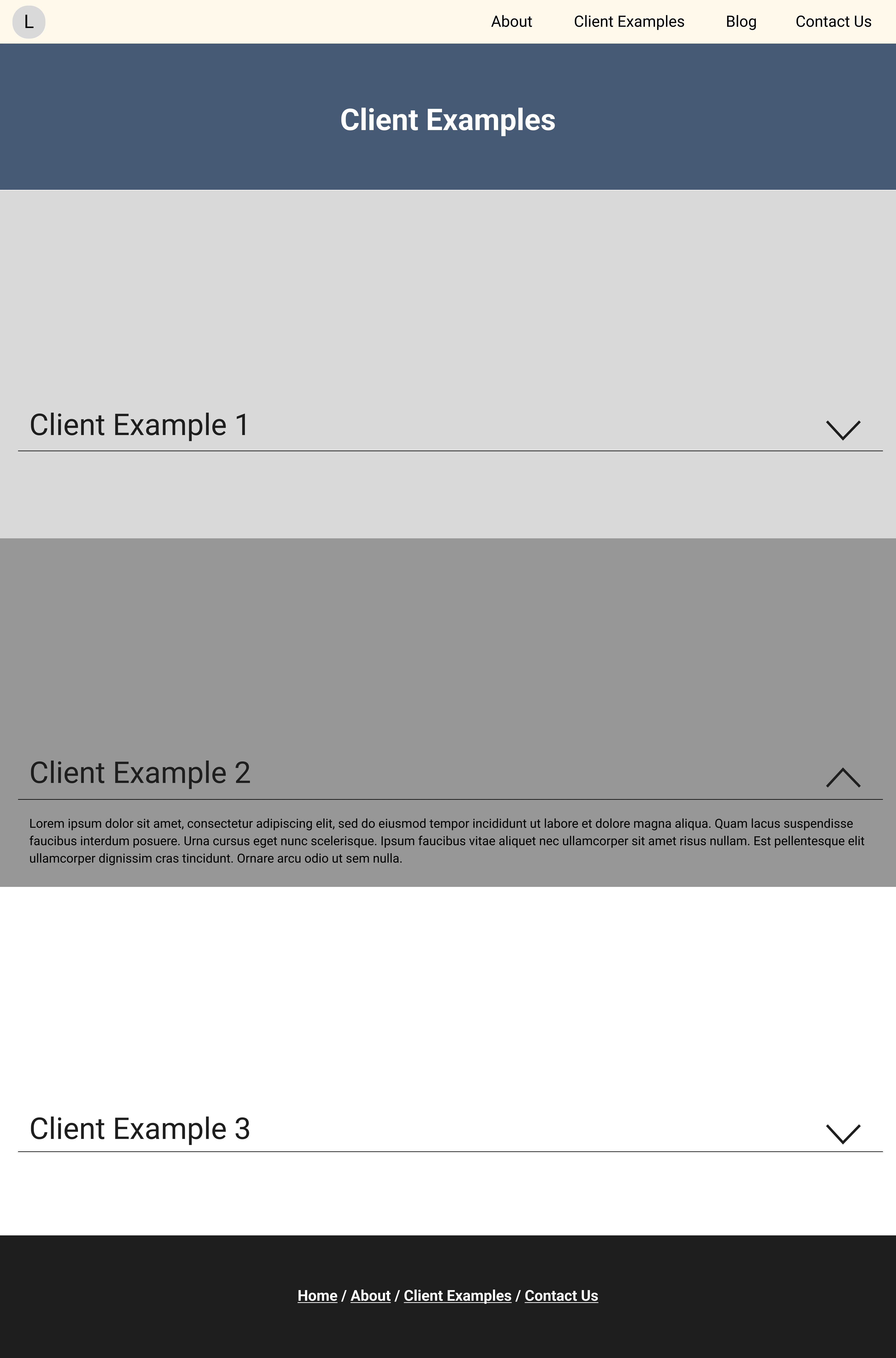
CLIENT EXAMPLES
Clicking on the "Client Examples" link, either through the home page or any other section of the site, would lead to a page that contained descriptions of relevant previous clients. Based on information given to me by the founder, I wrote copy for these sections along with relevant client links.
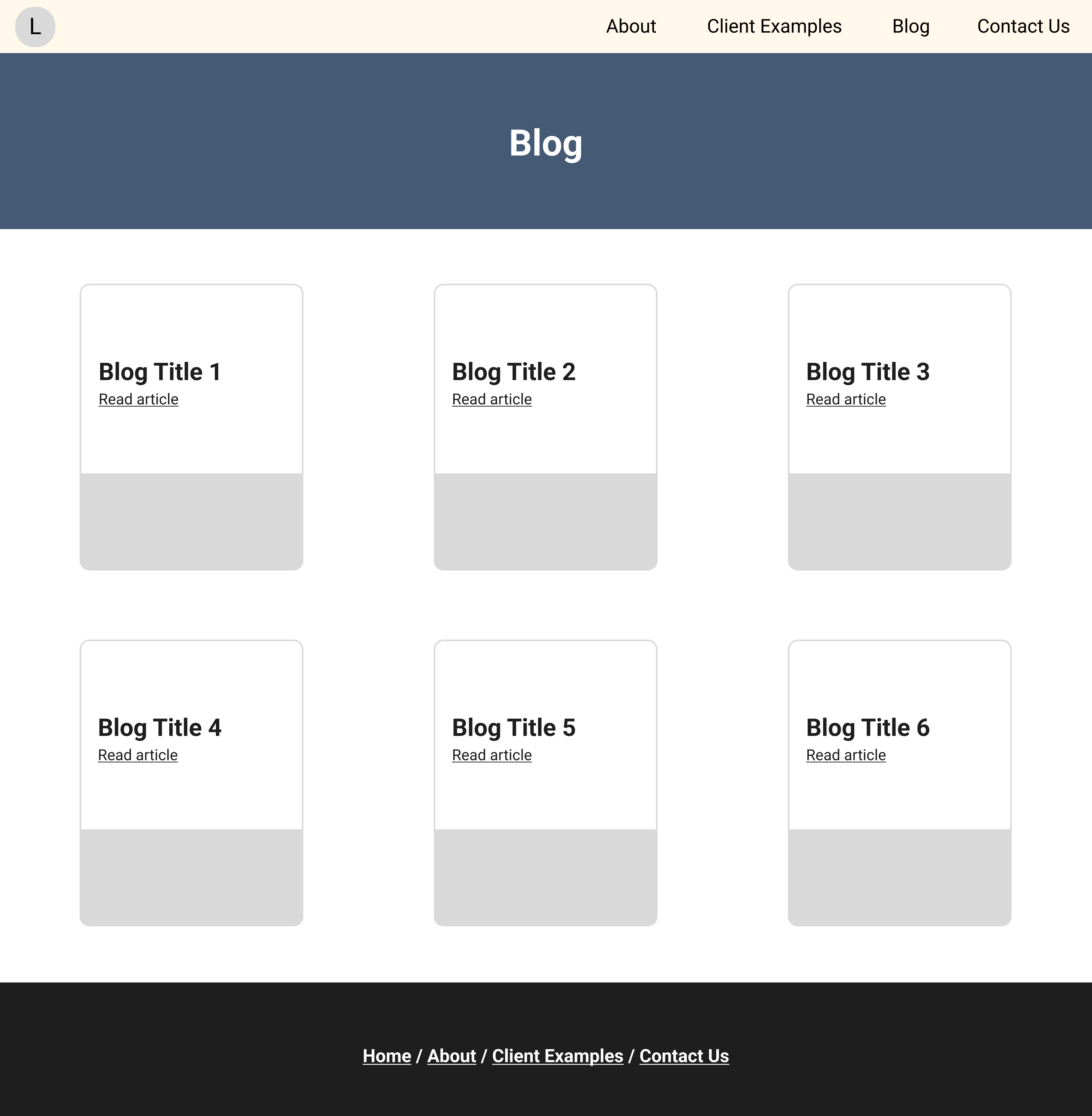
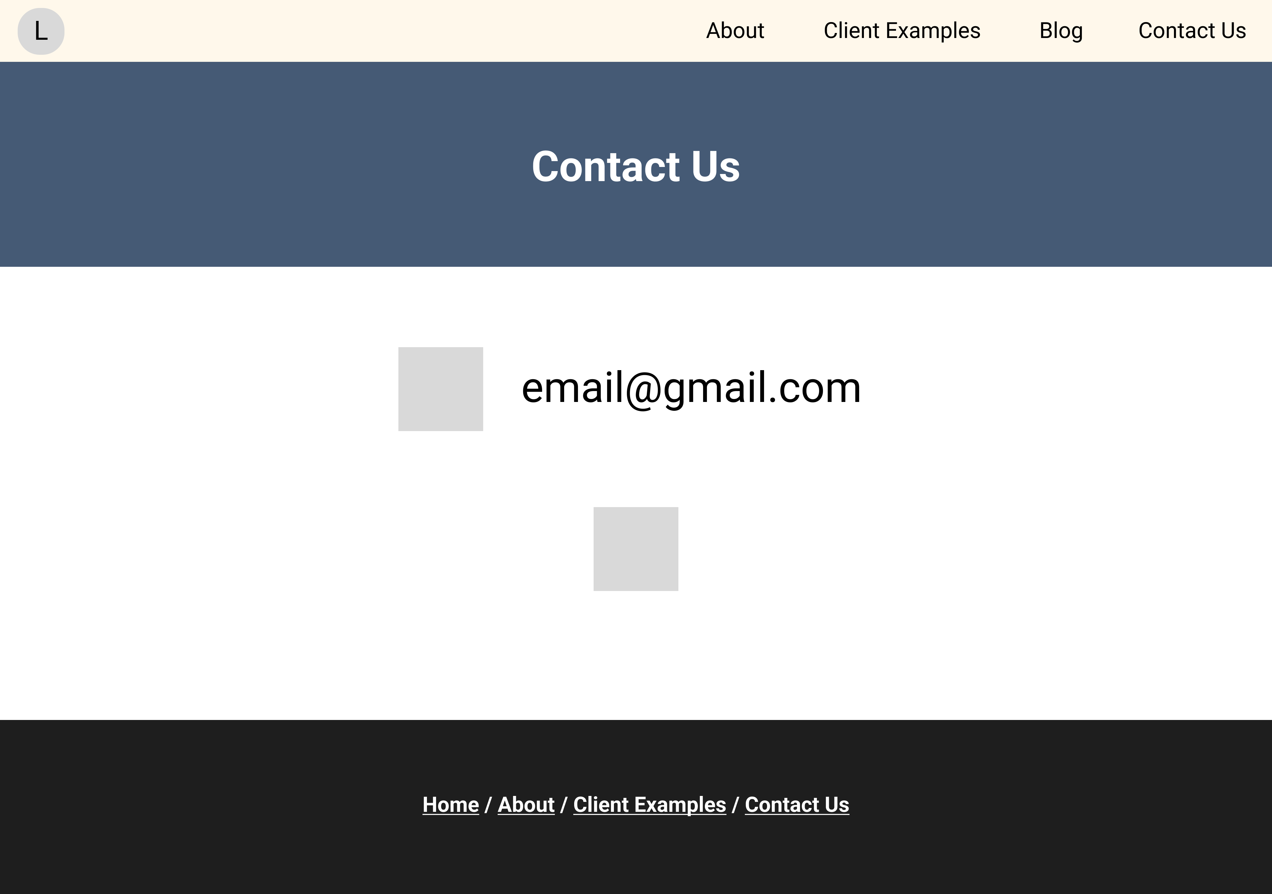
BLOG PAGE / CONTACT
To inject more of his voice into the site, the founder also requested a potential blog section for future expansion. This, along with the contact page, made up the final prototype for the Campanile Partners site.
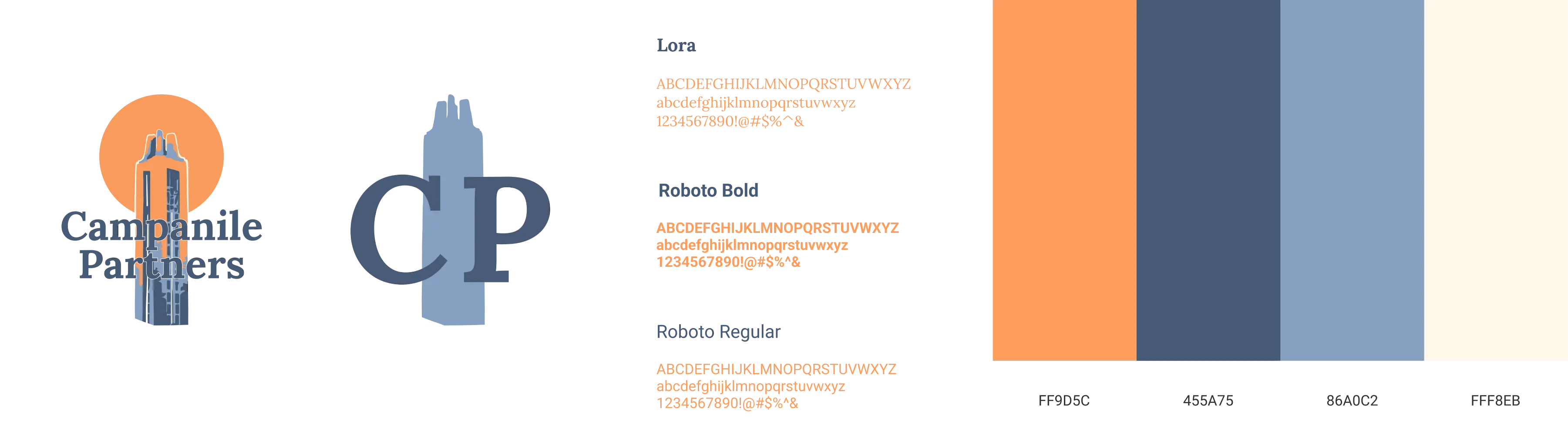
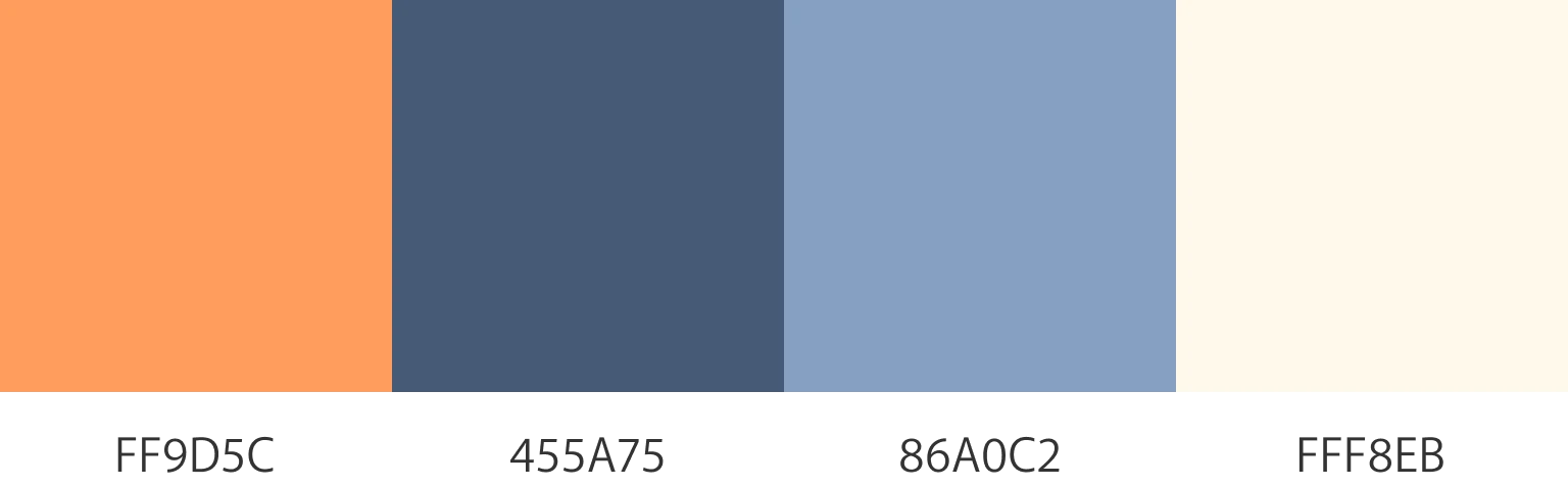
THE COLOR PALETTE
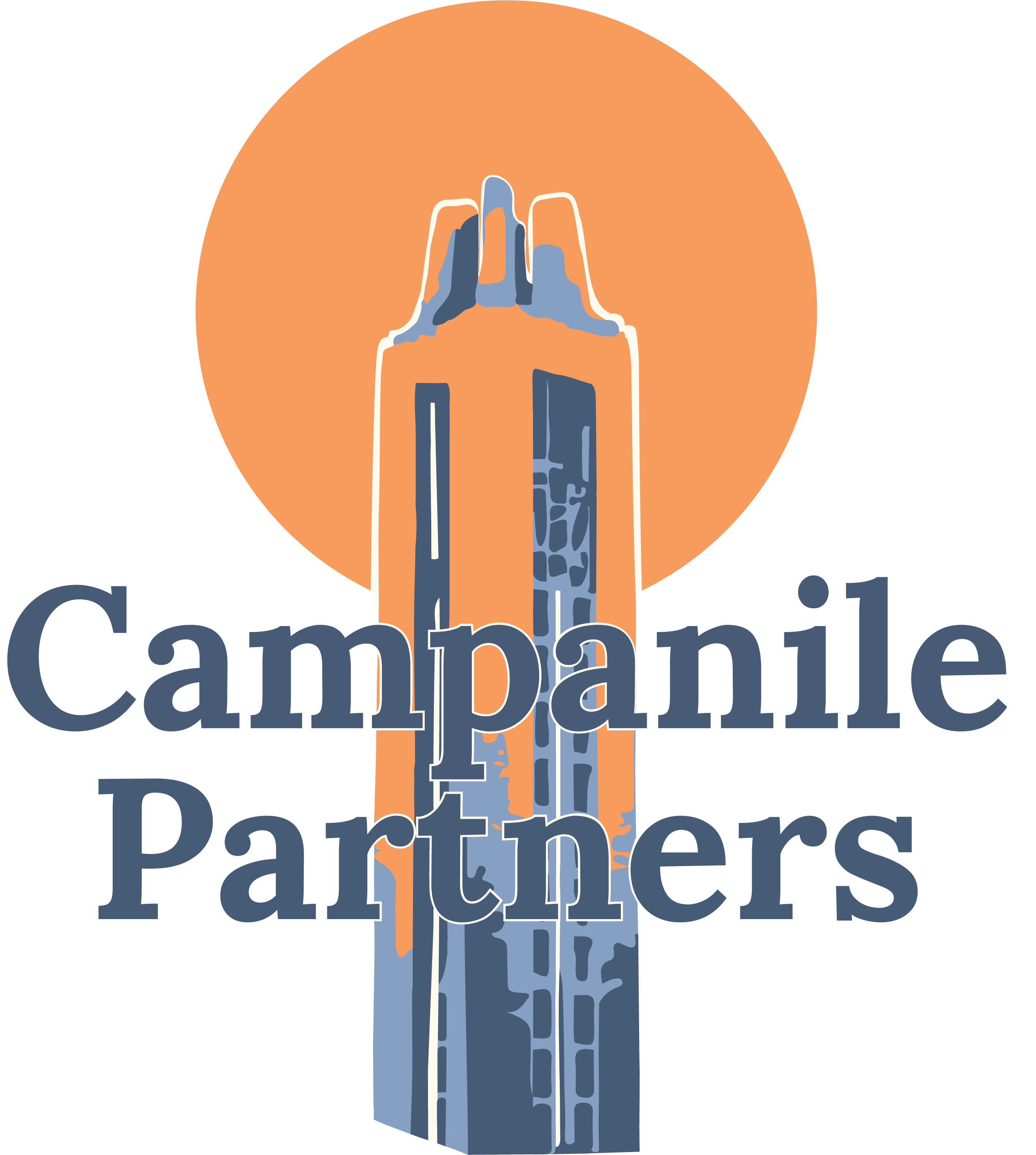
Campanile Partners' brand identity was inspired heavily by the Memorial Carillon and Campanile in Lawrence, Kansas, an important monument in the founder's hometown.
We knew that the Campanile would be central to the logo and brand design, and so all iterations revolved around it. Upon further research, both the founder and I found images of the Campanile at sunset especially evocative; therefore, color palette moved in a direction that suited such an image.
TYPOGRAPHY
This was a relatively simple process: typography for Campanile Partners primarily revolved around readability and usability.
Under the constraint that the Campanile Partners site was to be hosted by Google Sites, I centered my search for the Campanile Partners type in Google Fonts. Following discussions with the founder, we settled on Lora and Roboto.
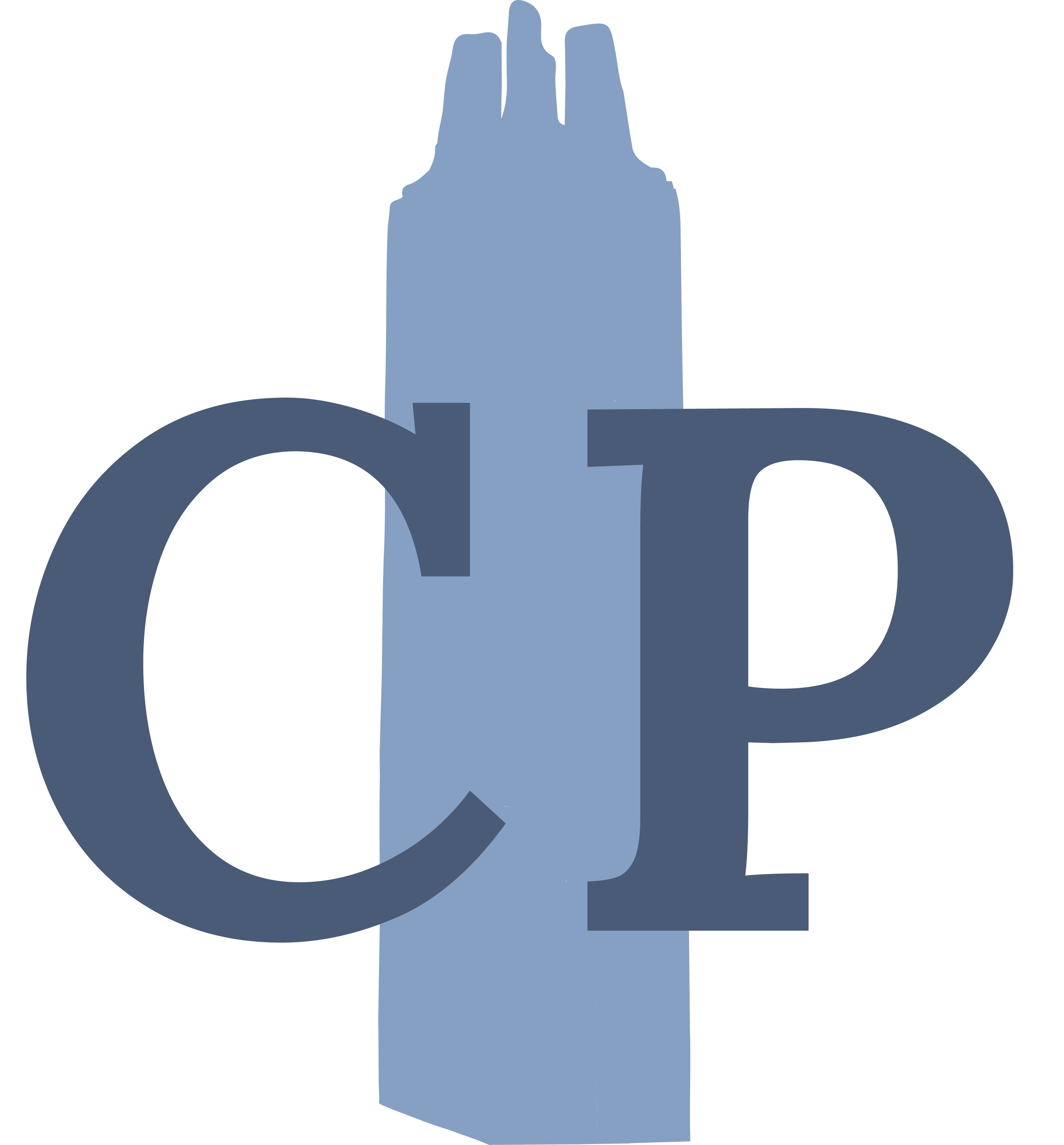
LOGO
Campanile Partners aims to serve as a guide within the realm of tech and telecom. Therefore, I aimed for a design that depicted the Campanile at a vantage point, somewhat similar to a lighthouse.
Therefore, initial sketches centered the campanile's silhouette on a hill. I was also provided with some inspiration from the founder's sister, and I incorporated her sketches into future iterations as well.
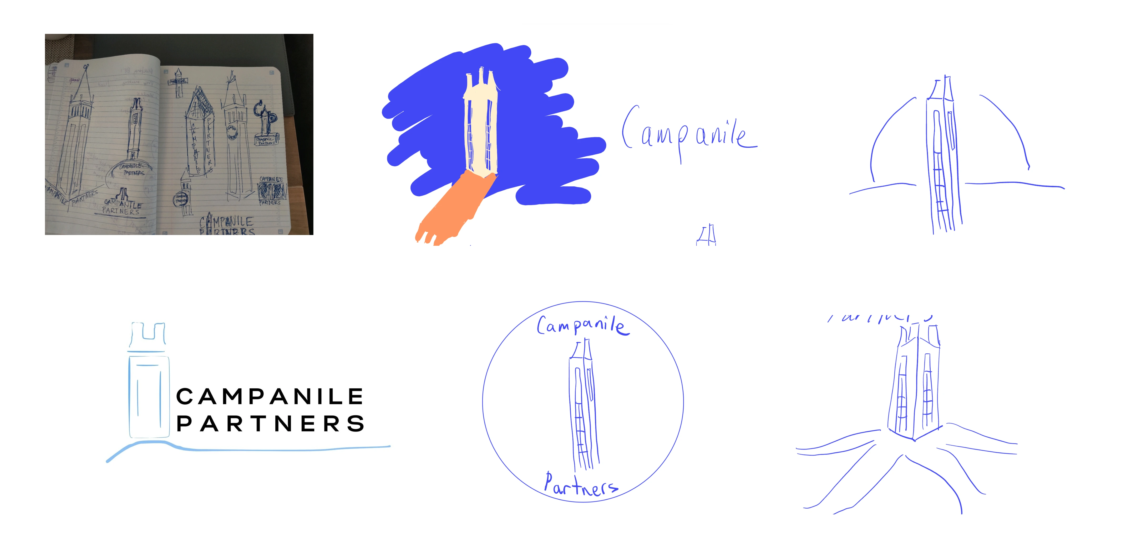
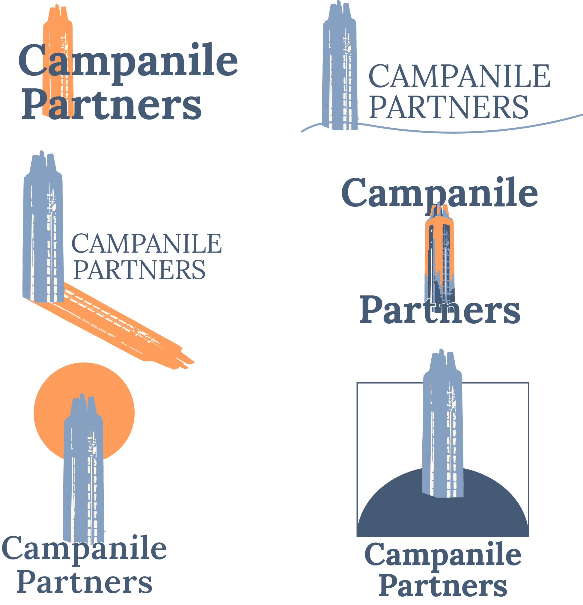
Here are the final two logos:

You might have to self-learn... A lot. Coming into Campanile Partners, I'd maybe used Figma once, and had a rudimentary understanding of the Illustrator pen tool. I quickly understood that without extensive guidance, I needed to self-learn these topics on my own, and to find the appropriate times to do so.

Know the value of balancing options with assertion. Especially during the logo creation process, I learned how to navigate discussions with clients. Knowing when to asset my expertise in visual design, and when to step back and respect the client's wishes was an essential skill.
"Users" don't take on a One-Size-Fits-All description. When creating the Campanile Partners website, I considered not only the site's visitors, but also the founder. That meant that interface design wasn't everything: I had to host the site on a platform with a low learning curve, and to pass on any relevant knowledge to the founder after my internship term ended.
Made with Webflow by Sophia Cheng — 2025 — All Rights Reserved