
TENS Device: App Design
Keeping users with dexterity and mobility impairments in mind, I designed an app that allowed users to control a TENS Unit from their phone.
"How can I use a pain-relieving device, if my pain keeps me from controlling it?"
A TENS (Transcutaneous Electrical Nerve Stimulation) Unit is a non-invasive pain relief tool that uses low-voltage electrical currents to stimulate nerves for therapeutic purposes. They're frequently used for a plethora of acute and chronic pain conditions, including back pain and Osteoarthritis.
The inclusion of buttons and knobs in TENS Units isn't conducive to those with mobility or dexterity issues, especially in cases where they need to exert precise, concentrated, and repetitive force to achieve the settings they need.
Therefore, during this project, I aimed to design an app that:
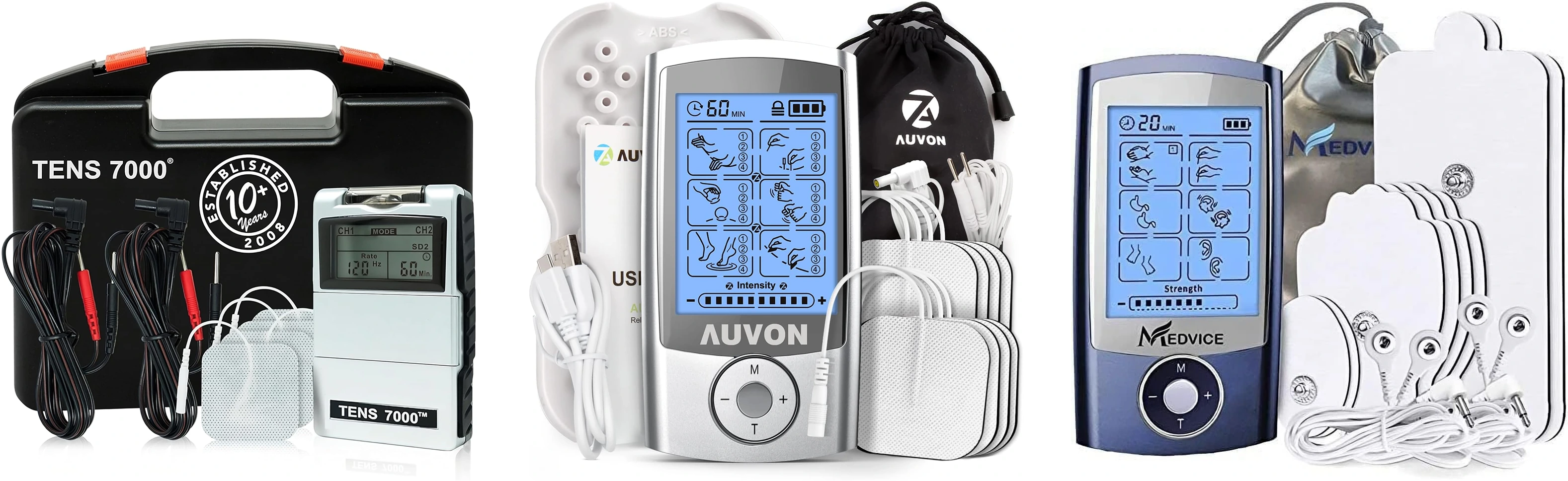
Before diving into user flow creation and prototyping, I first needed to nail down the challenges introduced by TENS Units' design. In this particular study, I focus on the TENS 7000, which has over 100K reviews on Amazon.

PRECISION REQUIREMENTS: BUTTONS AND KNOBS
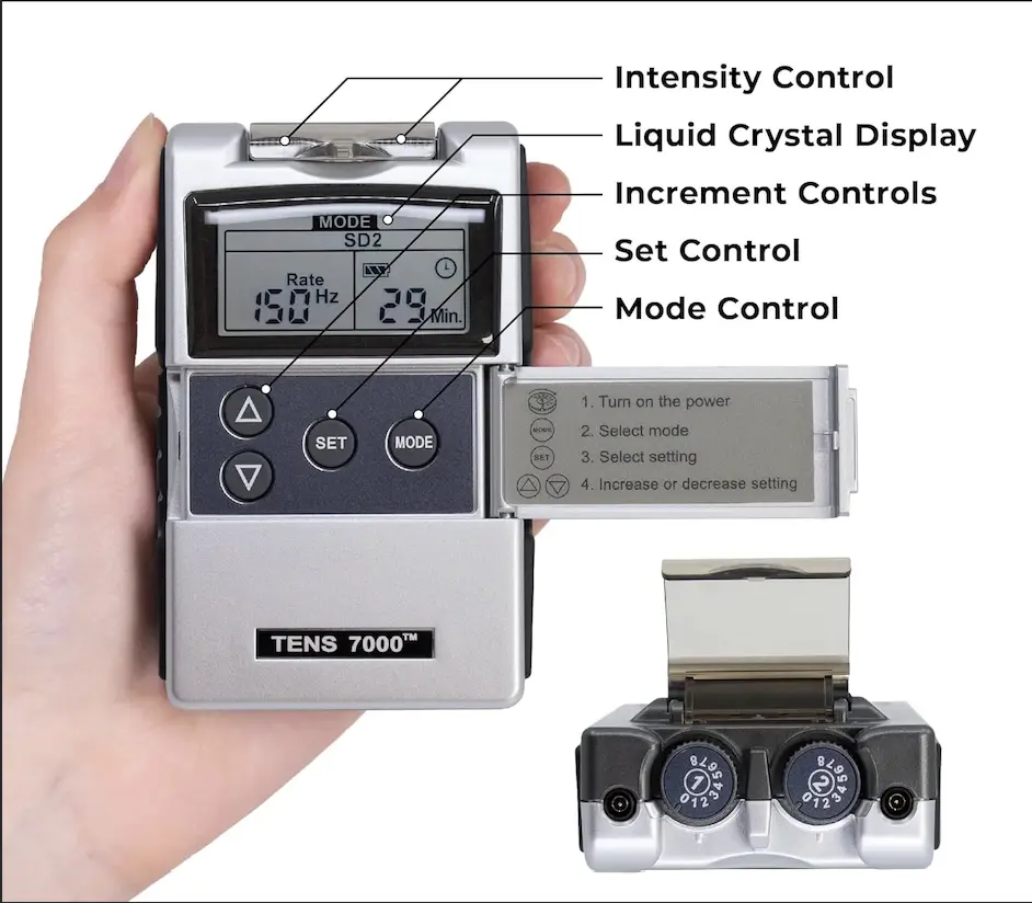
Buttons often require precision movements: AKA, the user's hands must press the right button the right number of times for the desired effect. These tasks are made harder by conditions like arthritis, stroke, and cerebral palsy, affecting the range of motion in one's hands (Reach and Dexterity, Inclusive Design Toolkit). Meanwhile, the knobs at the top of the device require a certain level of dexterity and precision to start the unit and to adjust the intensity level.
The TENS 7000 contains five presets, and a range of customizable settings. To adjust each one, the user must repeatedly press the "Set" or "Mode" buttons, then making extra adjustments through repeated adjustments of the up and down arrows and careful knob dials.
This isn't a good thing!
Those suffering from chronic and acute pain conditions are also the target audience for TENS Unit users. In my design, I aim to avoid high precision requirements for a cleaner user experience.
AN UNCLEAR INTERFACE
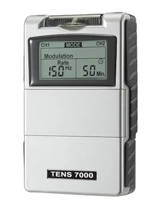
The TENS 7000 Unit display contains the following information:
The interface is unclear, and doesn't demonstrate all information at once. This may confuse and disconcert those with low tech familiarity. Additionally, it doesn't have an emergency stop button. This introduced a new goal: creating a visually cohesive and easy-to-understand interface.
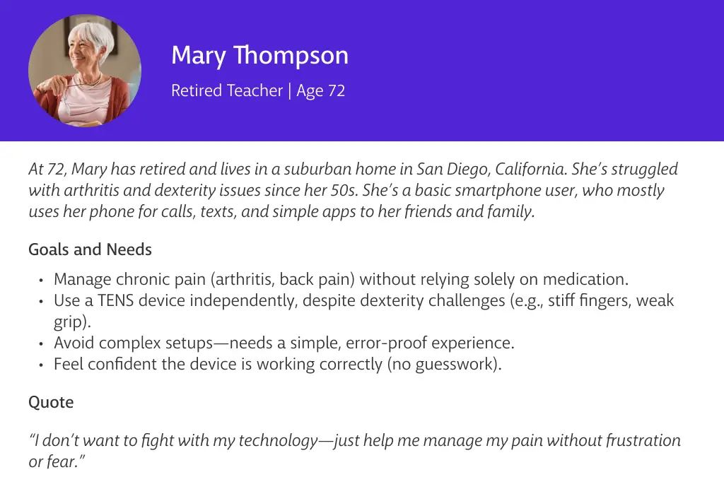
With my goal in place, I conducted a few TENS unit user interviews and compiled my data into a user persona:
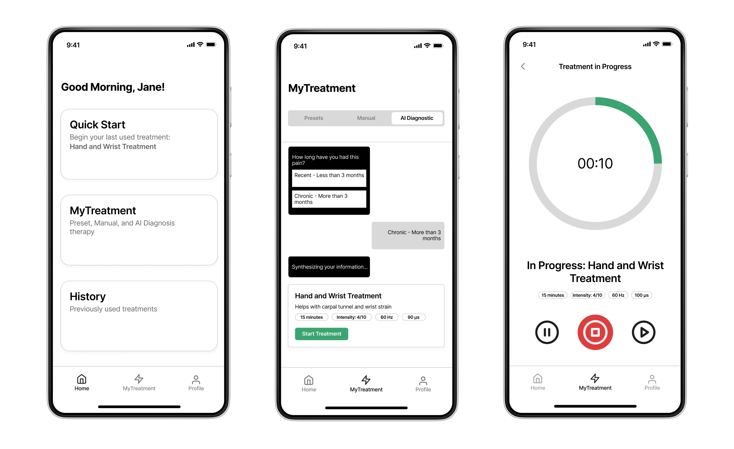
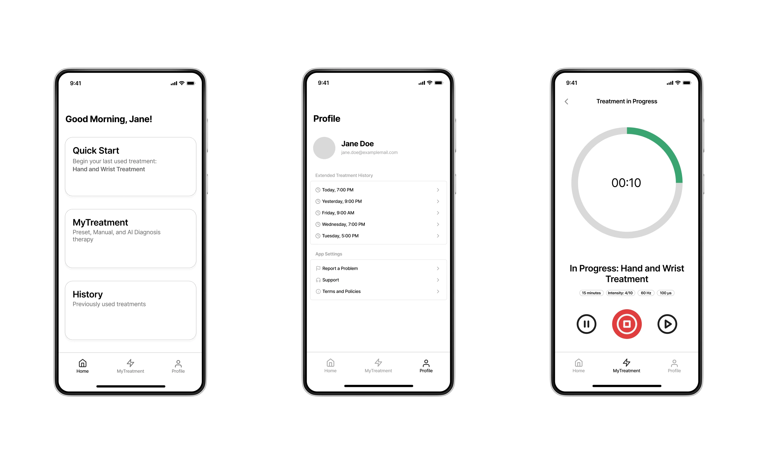
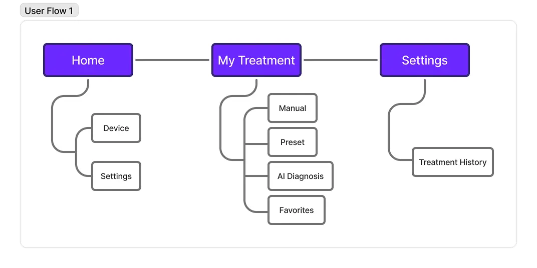
Initial user flow iterations kept it simple with a home screen, a "MyTreatment" section, and app settings. The biggest new feature I wanted to focus on was "AI Diagnosis", a feature that would analyze users' symptoms and recommend a preset.
Meanwhile, I went to the drawing board to conceptualize potential interfaces. Remember: I was aiming for a clean, easy-to-use interface with as little interaction as possible.
Further research and advisor feedback led me to adjust my user flow:
This new flow built on previous work to add Bluetooth Onboarding, a Quick Start option, and easy access to "MyTreatment" and recent treatments. Changes were motivated by shortening the user flow: for example, for a habitual user of the "Carpal Tunnel" treatment, the user would be able to start their treatment by simply opening the app and select "Quick Start". This would be a much quicker option than forcing the user to navigate to "MyTreatment", select a preset, and start the treatment.
Meanwhile, wireframe edits were made in the interest of avoiding repetitive interface interactions and high precision requirements. I made changes to:
Here are preliminary wireframes for the main pages!
INTERACTION VIDEO: BLUETOOTH ONBOARDING, HOME PAGE, MYTREATMENT AI
I'm not done yet! I still want to iterate on the following:
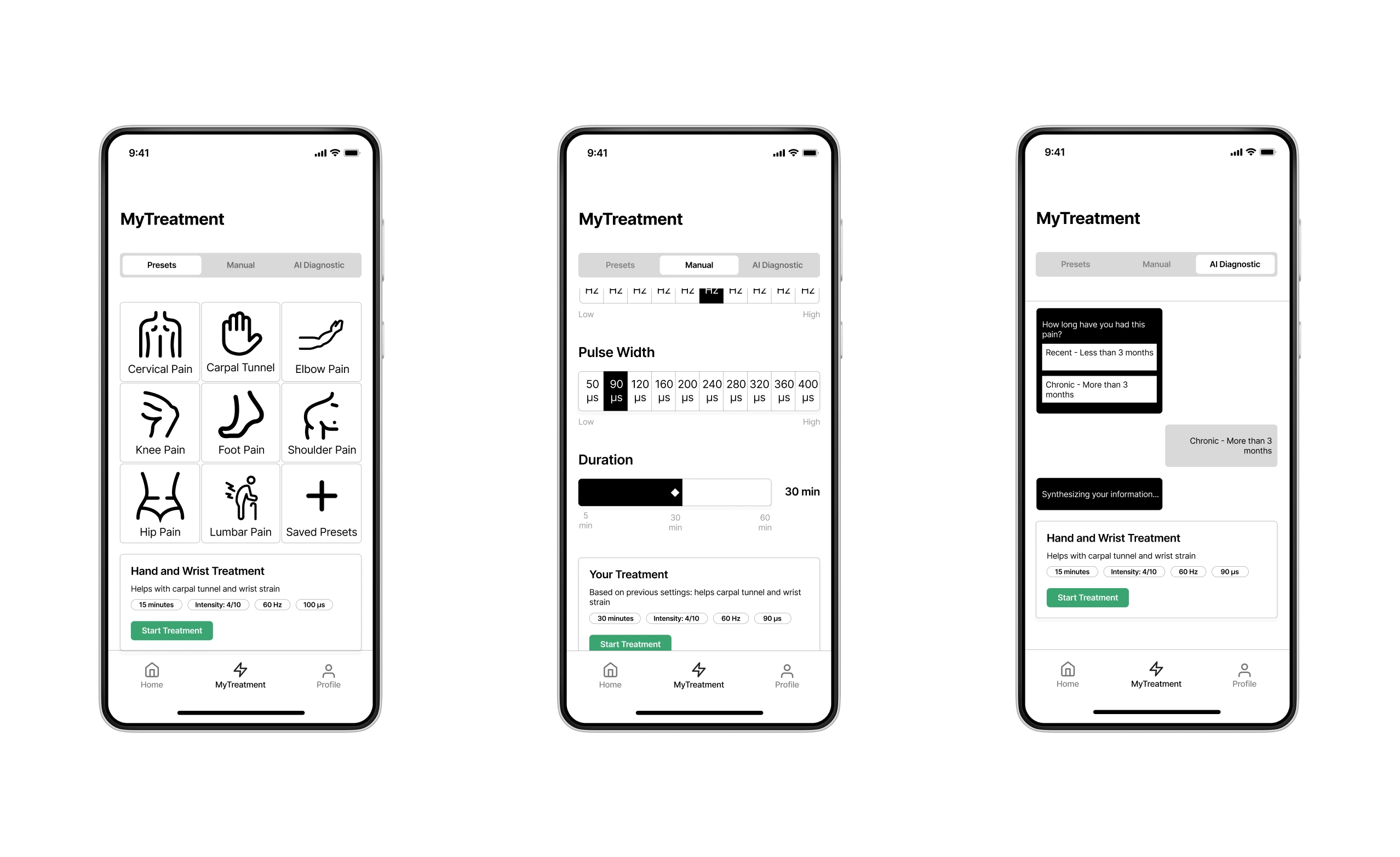
MANUAL TREATMENT
The Manual treatment section is overloaded with information, which makes it visually cramped and informationally confusing for those who aren't familiar with terms like "Frequency" and "Pulse Width". I seek to find a solution to this, by ridding the Manual treatment section altogether, and allowing the user to adjust "Basic" or "Advanced" settings while the treatment is in progress.
DESIGN SYSTEM
Keeping with my goal of creating a visually cohesive and easy to understand interface, I plan to create a design system with readable typography, simple color schemes, and proper color contrast aligning with WCAG guidelines.
Takeaway (so far)

The most prevalent design isn't always the best one. When designing for the Manual treatment, I gravitated towards sliders because it was "best practice" and was most visually compelling; however, it didn't fit with my accessibility goals.
Made with Webflow by Sophia Cheng — 2025 — All Rights Reserved